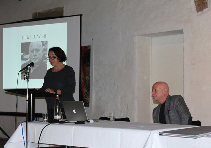
From edition to unique
Lecture at
2nd International Printmaking Symposium Bentlage Rheine Germany
(Out of the Studio)
In the early 1980ies I was devoted to the topic “landscape”, its structures and formal phenomena. At this the perspective was not towards the horizon, but more top down. For example I depicted the traces, which were left by plowing in a field. In the middle of the 80ies the colored spaces have taken a back seat, the line became more important in the etchings. Simple archaic forms like wedge, rectangle or circle gained significance. The dynamic attained precision, the forms changed and an interplay of forms was starting.
Simple signs and symbols got in contact or in rivalry to each other, or forms were repeated to create patterns. I more and more distanced myself to nature, until I again arrived at architecture, which was my job before my academic studies, when I worked as an architectural draughtsman.
From landscape to architecture
For me art is a big adventure, an experiment, a discovering and experimenting of areas and my favorite playing field. For me it is not possible to separate art from the artist, not from his life, not from his experience. Hence, my art is not in the first instance, but still to some extent somehow biographic, social and political. The intensity of the influences and of their combinations does change. The same is true for place and time, cause and motive. Traveling to the Himalaya is echoing in my works just as afternoons at a swimming lake, the amazement about a building or researches in the internet. And sometimes even images of TV- news and daily newspapers attract my attention, my enthusiasm and flow into the process of form finding.
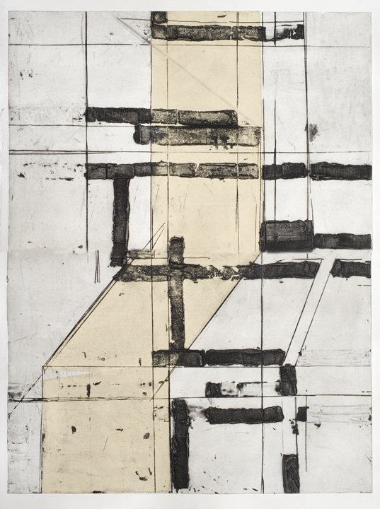
In the recent past I’m finding such key- pictures more and more in the sector of architecture. My early pictures, etchings and installations have had the landscape as motives, this partly wild, loose chaos of structures, those unattached, not- planned insights and outlooks. But in the past years the chaos gave way to order. The structures are not longer unrestrained emotional, but rather assort rational in most cases. They are descended from the world of construction, the planned fixation of simple graphic elements like verticals, horizontals and diagonals. Thereby I’m fascinated by those fundamental constructive details just as well as the superordinate dimension of architecture in form of the urban space.
Architecture: fragments
A glasshouse, a winter garden, a roof bracing, a staircase or bucket excavator‘s leads before the new building – the different rroms of appearance of architecture get more importance in my art since years. They become cause of an artistic consideration, of a graphical examination, of manual experiments. Though, there are often not more than patterns in the end, which is neither bound to time nor place nor an object. What is left is a moment of absolute, elemental constructive tension.
Exactly describable architectural details lose their materiality, are reduced to a graphical function. That is what I am interested in- the functioning of forms in an interplay with other forms, single lines and brace lanes, coloured areas or bunches of lines. This may really be something like a game, even if the process of development of the etching needs concentration and seems straight at first sight. The creative process is about discovering and exploring possibilities. I want to identify the border of the practicable, concerning the cooperation and conflict between different forms and concerning the balance between dynamic and tension. But I also want to find the limits of the technique and of the material used.
For that I apply many different etching techniques in most of my works. The containment of technique in every detail is not the end in itself for me, no show stage for something sophisticated or difficult. Much more important is: the sovereignty in handling the printing process and my materials allow me a huge creative liberty. Thus I can react on accidentally occurring or just discovered things more quickly. I can be spontaneous and regulate the procedure on the printing plate new without losing sight of the completed graphic work. And I can implement a pictorial gesture, what enables me to handle the big sizes of my graphic works.
Like already mentioned I use the term “drawings on zink” for my works. This term does not only reflect the work on the metal plate. There are parallels to my drawings on canvas in the work with the printing plates. The plates rarely are used only once. Rather they lean against the wall in my studio for many weeks like my pictures do after the first make-up. There paintings and metal plates are waiting until I know, how to add the motive, how to finish it, or how to arrange it completely new.
This procedure does not mean, that I am undetermined or aimless. In fact I love and need the dialogue with the printing plate. It has to grow, to develop. This state of uncertainty between the first idea, the first execution and a possible change brings out something new, at times something completely unexpected. And then eventually a state is reached, in which I overwork the plate, sometimes only selectively, sometimes radically. That is how a new unique copy develops in combination with different plates or coloured papers. I am not interested in printing many copies. I appreciate the uniqueness of the printed sheet of paper. In this sense there is no difference to painting.
The over printing produces an accommodation on itself somehow. But I also use different techniques and work steps to lead the etching out of the two- dimensional. Like I work sand and other materials in the colours I use for the paintings to achieve one special effect and plasticity. I use carborundum in etchings to create a high mass volume and open upthe graphic in the room.
I also work in coloured papers in some etchings. In the past this technique has been used in advertisings to save colour in lithographs. The wet, coloured paper is put on the plate and printed on the printing paper. Herewith I reach forms which appear as a plane, coloured contrast and also as a supporting form, as continuation of the graphical elements of in a new section, formally and with regard to contends. The etching gets a special accommodation by those printed papers very often.
To bring in the graphic into the room- that is what bothers me already for a long time. That lead to the fact that I did experiment with not that easy printing of transparent papers. Double- paper- etchings arised from that. An etching serves as base- paper, in front of that you hang up an etching of transparency paper which corresponds with the motive of the base- paper, even if it is a little controversial sometimes. As a result you might get a diffuse impression. Hence, a room is built in which those etchings have got a dialogue, developing a non-visual but still guessable relation- network.
Architecture: house
You cannot elude architecture. Even the landscape reflects the creative will of people nowadays over wide areas. We are living in houses, our attitude towards life we call urban. Houses serve in their construction the individual needs of their residents at best, orientate themselves in form and material at the mannerism of the natural environment very often or result from urgent instructions, which are defined as collaborative consensus by technocrats. And houses can tell stories.
However, house motives get subject of my work only after finding ONE picture for all those many pictures. As it is THIS special picture which counts more than one episode for me, which reflects my experience, my thinking and which satisfies my aesthetic sense, which is qualified for being an archetype of further evolving pictures. I do not have to search for such pictures. They come automatically- for example in television or in daily newspapers.
For example there is a burning skyscraper in Bagdad. It could even be in another time in another country. What I was interested in was not the militant spectacle of the air raid, the brightly blazing flames. It was the dark, the black, which is left after a fire, when every living creature and everything soft is lost and only charred hard rests of dead material remain to convey of the disaster.
For example there is the finance temple of Lehman Brothers in New York, a banking tower standing for the power of money in every big city. Since the last bank crash we know that this once glittering facade is not shining any more. That here- and soon in the whole world- the lights in many mega- shrines of materialism are switched off. In the middle of the brightest shine of a game promising an endless always growing yield return, the darkness of the finance power opened up. Also here for many people only burned earth is left over.
And it was this, what fascinated me graphically: the black leftover after a real or symbolic fire, which dispersed the vivid and bright out of the big buildings. In Germany the printing craft is also called “black art”. Here black does not mean the absence of light, but it means the substantial forming element. I wanted to expose this corpus like of the black, the real leftovers of the skyscraper, the symbolic dark material of the bank crash. The black creates its own, dark area. It is eliminating live. Small lightened islands seem like accidentally escaping leftovers of the disaster, like current, non permanent light- appearances. The black buildings are ruins, abandoned by life and light.
In another work of this series, called “Sockel”, I approach the architectural details once again, despite of imagining a scene of buildings. Here, I somehow played with the principles of creation in this series. The base keeps its threatening darkness, but it has to face big zones of light. It is still undecided, if light eliminates darkness or vice versa.
The massive volume of the black in these works results not only from its dominance concerning colour and space. Moreover, it is the character of relief, which makes a visual experience out of the black. This effect is achieved by carborundum, a material which is put on the printing plate and leaves a quite expressive relief on the paper. This relief imparts to the black colour a special figurativeness. At the same time it emphasizes the material character of the subject.
Not only in these etchings carborundum is used as a central means of expression. My special kind of embossed printings creates an amorphous mass, in which cracks, crinkles, bucklings and fissures are to be seen. The mass has a vivid surface, many associations are possible.
With this coming out of the plane paper I produce an illusion of authenticity and of astonishment. The etching with its classical black and white character gets a pictorial effect. The motive gets more vivid, the etching allows more emotions in my creative process as well as in the mind of the viewer. At last carborundum takes away a bit of the austerity, which normally is a characteristic of graphic reproduction.
Generally, the use of carborundum suits to my kind of etching, because I understand my etchings as I have already mentioned as painting on zink plates. Also in my paintings I often try to extend the pictures into the third dimension by relief. For example I give a haptic structure to the surface by putting sand and other materials into the colour or by arranging different forms made of thick papers. Carborundum in the etchings looks like a thick layer of colour.
The etchings with embossing on hand-made paper of this series are made up of four parts and have a size of 2.12m on 1.52m. The size of my etchings may give hints on my big- sized paintings, in which big gestures need lots of room. In doing etchings I often think of pictorial gestures and effects or traces of the paint brush and layers of colour. Similar to my paintings I use old printing plates for further revisions to produce new graphic works.
Big sizes excite me, because they mean a special artistic and technical challenge. Limits are broken open, there has to be a contest with the material on a higher level. This also is part of the adventure “art”: the game with newly found creative expressions, the exhaustion of manual possibilities.
Etchings, which need so many different processes of thinking and technique do not become fights with the material for me. It is more a dialogue, within which I pose questions like: Which materials offer the best possibilities? What is allowed by the zinc plate? What can I do on the paper? What can be achieved by colour? Where do the possibilities of the procedure of printing end? The experiments of the material are not free from disappointments, but at the end they allow me to realize artistic ideas and to give a figure to emotions. Manual and technical perfection is not the goal in itself, but it is the pre-condition for an increased faculty of expression. In other words: If I am able to use all letters of the alphabet, I am able to formulate all thoughts in scriptural form
Architecture: city
At the beginning architectural details were in the focus of my etchings. Now in a new series my perspective was extended to pictures of cities. The constructive of architecture can also be seen in a higher dimension: urban space. The architecture of houses follows different needs and constrains. The same holds true for cityscapes. These are summaries of single creative plans and the technical regulations of communities. They consist of regional, ethnological and geographical features, of historical and economical conditions. In the ideal case you can guess the city or cultural area according to the pure picture of a street.
The urban space follows diverse technocratic, economic and ecological necessities and serves as a channelling of individual worlds of living. But where in the urban space can these worlds of living be seen? Only if you plunge into the city, if you look at it from the streets you can see a lot of these living worlds. The more the distance grows, the less you can recognize individual life.
These sorts of pictures you might know from different Hollywood movies and TV- productions. They are filmed from a helicopter, they throw a glance on the whole city, on the lights. The city looks like a black ocean with small lights on it. The city becomes an anonymous organism.
The creative process in my work contributes to this anonymization. In the internet I searched for urban spaces like these. The photographs taken from the web have a high definition of 72dpi (dots per inch). This is enough for a computer screen, sometimes enough for a reasonably good photo- print, but in any case too bad for a reproduction on a size more than two meters. If you transfer the small photos from the internet on a film, and transfer this on a metal plate, details are lost. With the etching by aquatinta the original motive again gets changed. The views of the cities become reduced to a black and white effect by printing.
Here the black colour gains an own corporeality. It is somehow a dark material, which keeps everything together. In this case the black colour is not a sad, dark rest after a bombardement or a crash, it is a mysterious brace, which enables us only to presume light zones. It depends on the urban experiences of the observer, if this black is taken as harassment or enthrallment.
The bright, monochrome areas beside the black ocean are intended to make the black colour bearable. On the other hand the contrast underlines harassment and darkness of the urban space. Some beholders recognized this contrast as a means of taking courage, that there is an alternative to this urban prison, that there is a space of liberty outside of the narrow urban space. It is only a small space of liberty, but this is bright and colourful.
Victim / Offender
Same approach, same technique, but a completely different world of motives: in the series victim/ offender I use the internet as a medium for research and fund of material. These etchings are photo-etchings, too. Since many years it was the first time I addressed myself to the human figure.
Here, the same holds true like in my urban spaces: in transferring the small size from the internet to a big-size zinc-plate and then to a big-size paper, details get lost. The traces of the transformations and of the treatment are traces of life, in this sense also traces of time and collapse. Memories fade. Pictures of commemoration sometimes show gaps. They even can become falsified in the course of time or can be turned into the opposite. What is the original then? What is the truth?
My etchings from the victim / offender series are localized in the space between recognition, memory and expiration. The face of Myra Hinley became an icon of the evil. She was a serial killer, who murdered children and teens extraordinarily brutal in the 1960s. The face of Hinley was a public image of inhumanity at that time. Everyone knew it for a long time. The more her face became the emblem of horror, the more this picture pushed the photos of the victims into background.
After Myra Hinleys omnipresence in all media it became clear: this is the look of a serial killer, the bad looks like this. But how is it with the victims? How does a victim look? The young victims of Hinley smile on the photos, they are still children or try to look seriously like an adult. They look funny, sullen or brisk, reserved, distant, questioning or bored. These are strangely ordinary photos. They have not been photographed as victims, but rather as bearers of hope, as proud of the family. These photos did not become icons and thus were forgotten soon.
The offenders press forward in our memory and in this way extinguish the lives of their victims once again. They loose face and name at the end and only exist as a victim’s number in a series of murders.
This is reflected in the enlargement and coarsening, when brought from internet size to the printing paper’s size. Persons of the original photos are only vaguely identifiable. Their forms are dissolving due to etching. The visible and the memory vanish. These works are etchings, but nevertheless I approach the subject in a pictorial way. In this combination of graphic and pictorial work I try to find a new form for the incomprehensible.
In this case I intend to find a way between a documentary effect with all traces of time like spots and scratches and a free creative effect. The creative effect intends to separate from the original incident and tries to lead the viewer to something new, something unexpected.
In my series “seven sisters” the starting point is less dramatic, but the portraits of my family members work in the same way like the victim/offender works do. In both cases it is about the value of memory. How much of the authenticity is still there after the whole working procedure? What tells us more about the portrayed persons? A photo is quickly made and consciously done. You have the smoothness of a mass product and the knowledge of its reproducibility. On the other hand you have the photo etching, a unique copy with apparent defects.
I believe that with the distance to the photo, which cheats authenticity, it is possible to get nearer to the person. The creative process is not mechanical, but is affected by my memories, by spontaneous inspirations. Here many things are incorporated: encounters and situations, affection and aversion, lots of personal emotions. Everything is in move. The viewer is invited to make his own picture.
Books and Cassettes
Basically these portraits are not completely told and therefore never ending stories for the observer. I hope this holds true for all of my works. And maybe this is the fact, which took me to tell longer stories with several chapters. At the beginning I started to arrange cassettes made up of different etchings, which treated one topic. Sometimes I added a text, which was especially created for that purpose. These cassettes could be considered as a collection of diverse aspects on a special subject. But some of these works attain an entity with regard to contents and form.
In this way I made books. You can thumb through these storybooks or can read them like a book, of course a book without letters. Others of these works are made as leporellos. You can fold them sheet after sheet or you can look at it as a whole. Here not only the visual appeal is very important, but also the haptic moment, the feeling of the paper in turning the pages.
Last but not least the binding is part of the picture and a formative element of the entire book. I experimentalise with different possibilities, try to fathom the limits of the material and the practicability. And in this process I myself am very excited about where all this is going to lead me
These states of uncertainty excite me, in which it is not known whereto the journey leads. At this point art becomes an adventure, it becomes an expedition to the unknown. And I think we should allow ourselves a bit of adventure in this scheduled world full of one-way-roads, rules and regulations and timetables.